
Most fitness websites don’t lose leads because they look bad. They lose leads because visitors can’t quickly work out who you help, what you offer, and what to do next. A fitness website audit is how you catch those gaps before they cost you another enquiry.
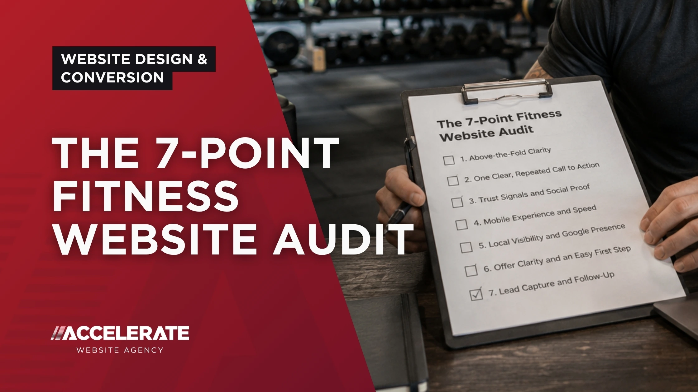
This is a simple 7-point audit you can run yourself in one sitting. Each point covers something that directly affects whether a visitor becomes a paying member or client: above-the-fold clarity, your primary call to action, trust signals, mobile experience, local visibility, offer clarity, and lead capture. Work through all seven, and you’ll usually find two or three quick wins hiding in plain sight.
Prefer to skip the manual work? You can take the free Fitness Website Scorecard and get a personalised report in about two minutes. But if you want to understand what’s actually being scored, keep reading.
What Is a Fitness Website Audit?
A fitness website audit is a structured review of how well your site turns visitors into enquiries and bookings. It looks at clarity, trust, usability, visibility, and conversion, not just how the site looks.
A good audit isn’t about design taste. It’s about whether the right person can land on your site, understand you’re for them, and take the next step without friction. Everything below ladders up to that one job.
Why Audit Your Fitness Website at All?
You’re already paying for the traffic, whether that’s through Google, ads, referrals, or your Instagram bio link. An audit makes sure that traffic isn’t leaking out through avoidable gaps.
Small structural fixes often beat full redesigns. You don’t need to rebuild your site to get more members. You usually need to fix a handful of the seven things below.
The 7-Point Fitness Website Audit
Work through each point in order. For every one, ask the honest question: would a first-time visitor pass or fail this on my site?
1. Above-the-Fold Clarity
The top of your homepage is the most valuable space you own. Within about five seconds, a new visitor should know who you help, what you do, and what to do next.
What good looks like:
- A headline focused on the outcome, not your equipment or your qualifications
- A single, obvious primary action (book, trial, consult)
- A subheadline or line that names your audience and location
Signs it’s costing you leads:
- A vague headline like “Welcome to our website” or just your business name
- A hero image with no message attached to it
- Nothing that tells a busy parent, professional, or beginner “this is for me”
Quick check: Cover everything below the fold. Can a stranger tell what you do and who it’s for? If not, this is your first fix. For the full breakdown, our guide on the essential homepage structure for fitness businesses goes deeper.
2. One Clear, Repeated Call to Action
Confused visitors don’t convert. If your site offers five different next steps, most people will choose none of them.
What good looks like:
- One primary call to action, repeated down the page
- Action-led wording (“Book your free intro”), not vague wording (“Learn more”)
- The same CTA near the top, after your offers, and near the bottom
Signs it’s costing you leads:
- Competing buttons fighting for attention (Join, Enquire, Call, Download, Follow)
- A single CTA buried once at the very bottom of the page
- Buttons that don’t say what actually happens next
Quick check: Count the different actions your homepage asks for. If it’s more than one, simplify.
Not sure how your site scores on clarity and calls to action so far? The free Fitness Website Scorecard benchmarks you against 150 leading fitness websites and flags exactly this. It takes two minutes.
3. Trust Signals and Social Proof
Once someone understands what you offer, they look for reassurance. Trust is what turns interest into an enquiry, and most fitness sites hide it too far down the page.
What good looks like:
- Genuine testimonials and Google reviews placed high on the page
- Real photos of your space, coaches, and members, not stock imagery
- Recognisable proof: results, accreditations, years in business, member numbers
Signs it’s costing you leads:
- No reviews visible without scrolling to the footer
- Only stock photos of models who’ve clearly never trained with you
- Big claims with nothing to back them up
Quick check: Within the first screen or two, is there anything that makes you believable? If proof only appears at the bottom, move some of it up.
4. Mobile Experience and Speed
Most of your visitors are on a phone, often mid-scroll between other things. If your site is slow or fiddly on mobile, you lose them before they read a word.
What good looks like:
- Fast loading, especially on the homepage and enquiry page
- Tap-friendly buttons and forms that work with thumbs
- Short paragraphs and clear headings that are easy to skim
Signs it’s costing you leads:
- Text you have to pinch and zoom to read
- A menu or form that’s awkward on a phone
- A hero image that takes several seconds to appear
Quick check: Open your own site on your phone using mobile data, not wifi. If anything makes you sigh, a visitor already left.
5. Local Visibility and Google Presence
For most gyms, studios, and trainers, the highest-intent visitors are searching locally: “gym near me,” “personal trainer in [town],” “[your area] fitness classes.” If you’re invisible there, the audit can’t stop at your website alone.
What good looks like:
- A complete, active Google Business Profile with photos and recent reviews
- Location and service-area terms used naturally across your key pages
- Dedicated pages for the areas or services you actually want to rank for
Signs it’s costing you leads:
- A thin or unclaimed Google Business Profile
- One generic page trying to rank for every town nearby
- No mention of where you’re based above the footer
Small fitness website lead generation improvements uncovered during a website audit can have a significant impact on the number of qualified enquiries you receive.
Quick check: Search your main service plus your town in an incognito window. Do you show up on the map and the first page? If local visibility is the gap, our gym marketing agency work is built around exactly this.
6. Offer Clarity and an Easy First Step
People rarely commit to a 12-month membership from a homepage. They commit to a low-risk first step. Your offer needs to make that step obvious and easy to say yes to.
What good looks like:
- One or two core offers featured, not your entire price list
- An easy entry point: free intro, trial, taster, or consultation
- Enough clarity on what’s included that people aren’t left guessing
Signs it’s costing you leads:
- Every class and package listed with equal weight
- No obvious “easiest yes” for a nervous first-timer
- Pricing so hidden that people bounce to a competitor to find it
Quick check: Is there one offer on your site a hesitant beginner could commit to today without feeling any pressure? If not, create one.
7. Lead Capture and Follow-Up
This is the point most fitness businesses skip, and it’s often the most expensive. Getting the click is only half the job. What happens after someone enquires decides whether they ever walk through your door.
What good looks like:
- A short enquiry form that asks only for what you need
- A clear confirmation of what happens next after someone submits
- A fast, consistent follow-up process once the enquiry lands
Signs it’s costing you leads:
- A long form that asks for everything up front
- No reply, or a slow reply, once someone reaches out
- No system, so hot leads go cold in an inbox
Quick check: Fill in your own enquiry form as a mystery shopper. How long until you’d hear back? If the honest answer is “a while,” start here. Our guide on how to follow up gym leads walks through the fix.
Your 2-Minute Self-Audit Recap
Run down this list and mark each one pass or fail:
- Can a stranger tell who you help and what to do next within five seconds?
- Is there one clear call to action, repeated down the page?
- Is trust-building proof visible near the top, not buried?
- Does everything load fast and work cleanly on a phone?
- Do you show up when someone searches your service plus your town?
- Is there one easy, low-risk first step to say yes to?
- Does an enquiry get a fast, reliable follow-up?
Any “fail” is a lead you’re likely leaving on the table.
Want that audit done for you, scored, and benchmarked against 150 industry-leading sites? That’s exactly what the free scorecard does.
Take the Fitness Website Scorecard
You’ll answer 10 short questions and get a personalised report with expert recommendations, no obligation, in about two minutes.
FAQs About Fitness Website Audits
How often should I audit my fitness website?
A light review every quarter is sensible, plus a fuller audit whenever your traffic, enquiries, or bookings shift noticeably. Small, regular checks catch problems before they compound.
Can I audit my own website?
Yes. The seven points above are designed to be run yourself. Where a self-audit falls short is objectivity and benchmarking, since it’s hard to judge your own site against how others in your area perform. A scorecard or expert review helps there.
What’s the single most important thing to fix first?
Usually above-the-fold clarity. If visitors can’t tell who you help and what to do next, nothing further down the page gets a fair chance. Fix clarity, then work down the list.
Do I need a full redesign to improve my results?
Rarely. Most fitness sites gain more from fixing a few of the seven points above than from starting over. A redesign only makes sense once you know structure and messaging are the real problem.
How is a website audit different from an SEO audit?
An SEO audit focuses on how you get found in search. A website audit like this one focuses on whether visitors convert once they arrive. You need both, but conversion is what turns your existing traffic into enquiries.
Final Takeaway: Fix the Leaks Before You Buy More Traffic
A fitness website audit isn’t about chasing trends or a shinier design. It’s about making sure the visitors you already have can understand you, trust you, and take the next step without friction.
Work through the seven points, fix the two or three that fail, and you’ll usually see the difference in your enquiries before you spend another penny on traffic.
If you’d rather have it checked for you, start with the free Fitness Website Scorecard. And if the audit surfaces bigger issues, that’s where a specialist fitness website agency earns its place.